Component content guidance
Problem: With limited resources and flat headcount, I asked myself how we could make the most of our resources to scale good content beyond the content design team.
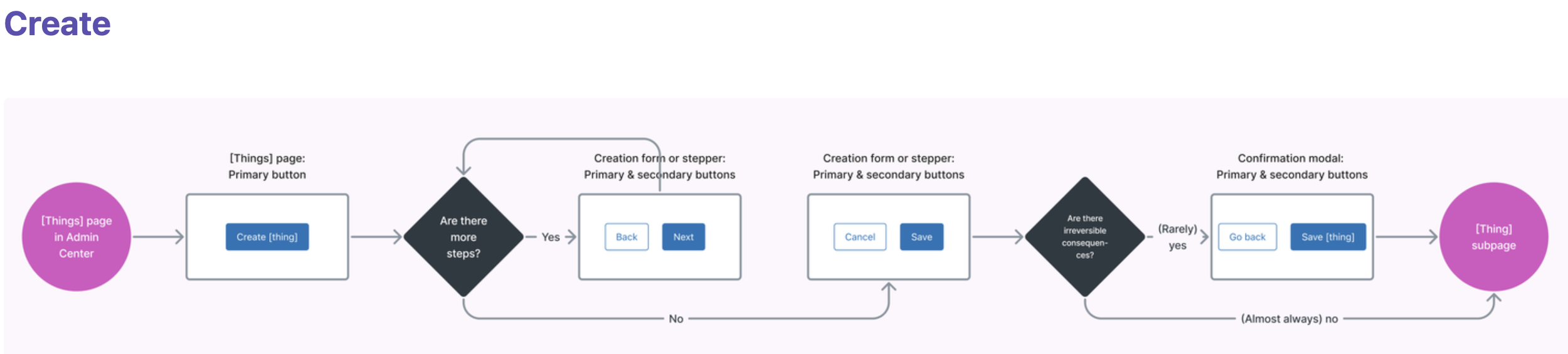
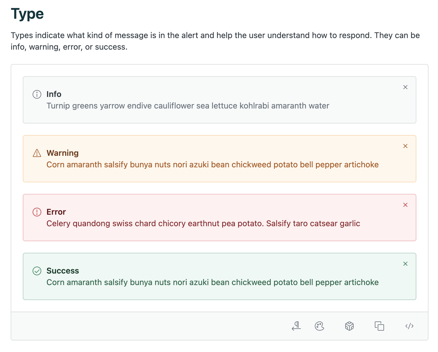
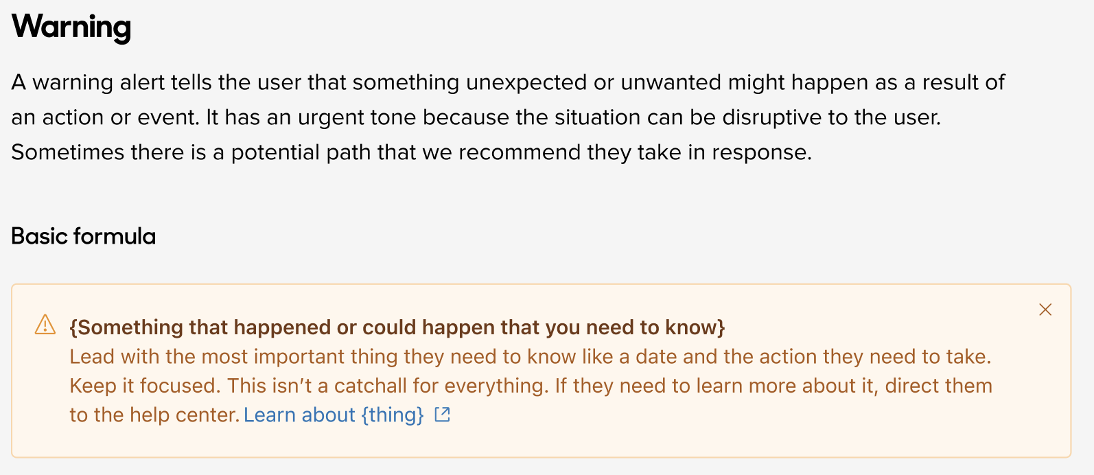
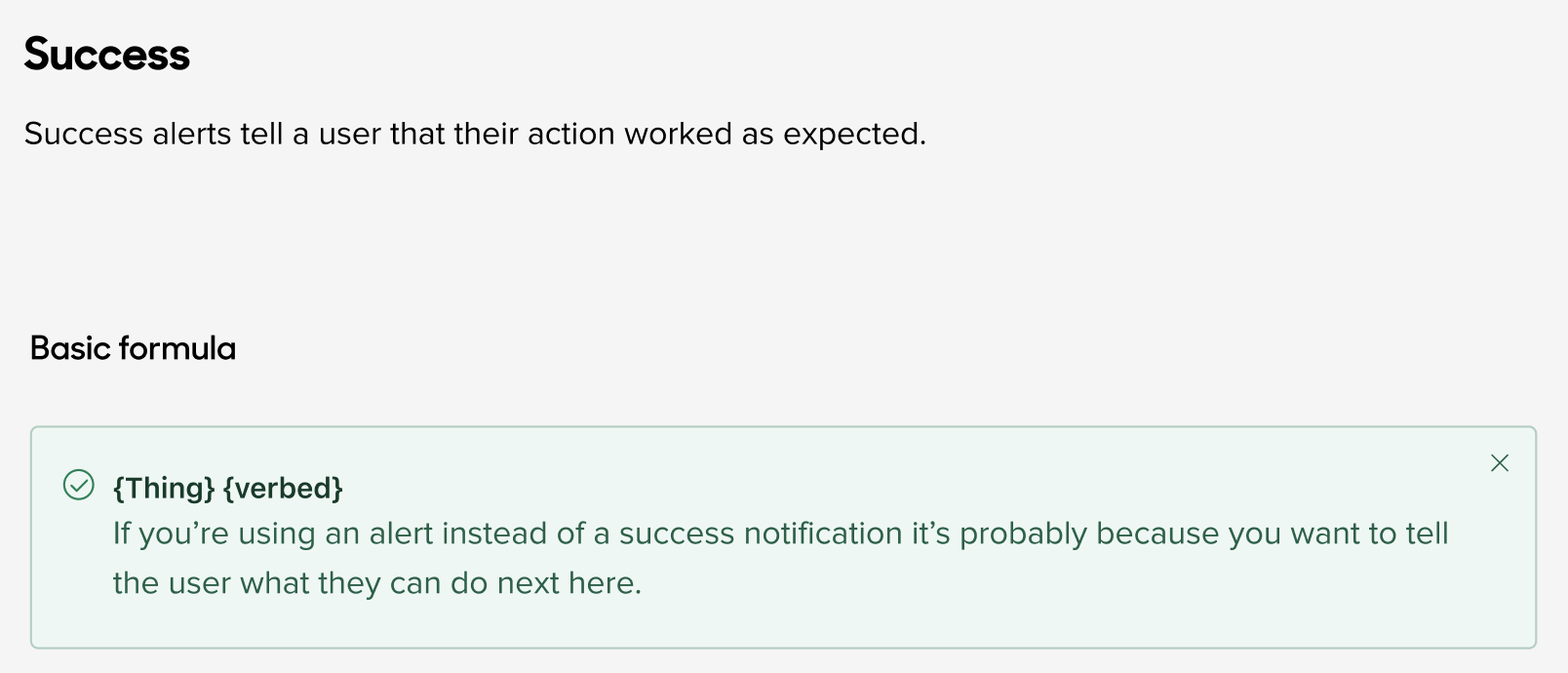
Project: Embed component-level content guidance and patterns directly into Figma.
Role: Project sponsor and approver
Approach
We went component by component, prioritizing the most popular and most complex content considerations
Created a Figjam file to collect examples from the team across the product asynchronously
Synthesize the examples to create initial draft
Used existing rituals to gather feedback and discuss contentious or complex topics
Partnered with the design systems team to publish guidance in the Figma library
Before
After


Outcomes
The good
The product designers and product managers that tested our guidance said it was extremely helpful
We launched guidance for 12 components in just 3 months
The bad
We learned that designers typically copy and paste components from other designs instead of using the component library, so our guidance was rarely going to be seen.
The pivot
We started adding our patterns and guidance to heavily used product area-specific UI kits. The extra contextual guidance has been well-received and used by designers.