Email connection wizard
I reviewed the flow looking for opportunities to eliminate unnecessary screens/steps/clicks, simplify content, and align on standards.
The first few screens had a lot of content and required several clicks to get things going. There was also some information that the user just didn’t need at this moment, creating even more cognitive overload.
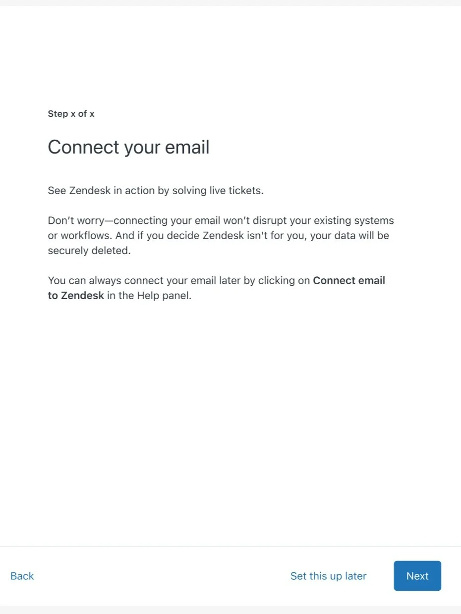
I was able to get this down to a single screen with a better content experience.
A benefit-focused headline
Easy-to-scan headlines that more clearly articulate their options
More succinct description copy that gets to the pros and cons behind the options available
An actionable first step in the flow instead of just heavy content
Problem: Connecting an existing customer support email during the trial experience has been shown to be one of the top indicators of success for both conversion and adoption after purchase. But only a small percentage of current trialists connect an email.
Project: Create a prescriptive wizard to simplify the current in-product email connection process.
Role: content designer (who came in after leadership was concerned about the proposed experience)


Reduced to a single screen
Simplified steps by removing redundant content
Clearer confirmation checkbox content
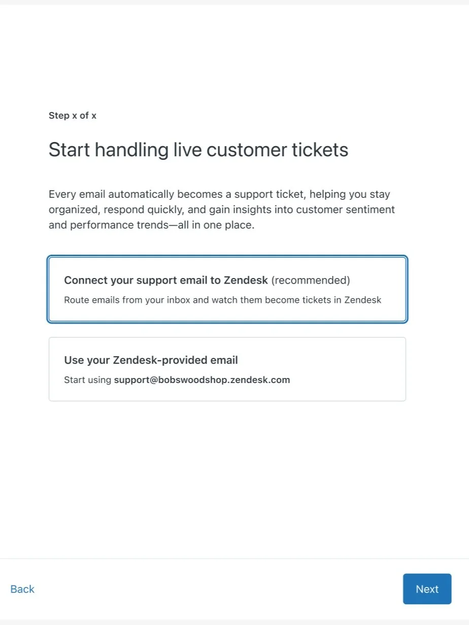
For one of the options, more step-by-step instructions were needed. Again, I saw an opportunity to simplify and clarify the experience.
The checkbox at the bottom was especially unclear since just completing these steps doesn’t mean I’ve finished setting up email forwarding. And the troubleshooting message at the bottom needed to be pushed to later in the flow since they won’t see tickets in their trial until this step is fully complete.
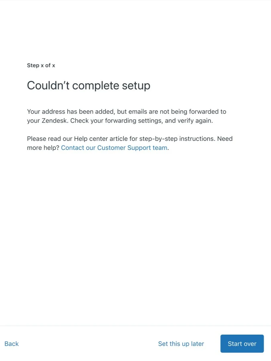
“Start over” was a very confusing button at this point in the flow and could cause users to hesitate attempting to connect again. Do I go back to the very beginning of setup? Does it just attempt to connect again?
I updated and simplified the content to follow existing standards and clarified the main button copy to give users more confidence to exactly what would happen.

