Product tray menu
Identifying an opportunity
Problem: The product tray menu, where customers go to navigate across Zendesk’s various capabilities, was riddled with issues. I’ll tell you more in a bit.
Role: Project initiator/driver, Design sponsor/leader
As the leader of both content design and design systems, I was asked to lead an effort adding a new acquisition into Zendesk’s product tray on the design side. This was the first we’d updated the product tray in years and I quickly noticed some problems and an exciting opportunity.
First, let’s talk about the problems:
UX problems
There were slight visual differences to the tray across the product since it’s built and managed by teams individually
The product tray had several accessibility issues
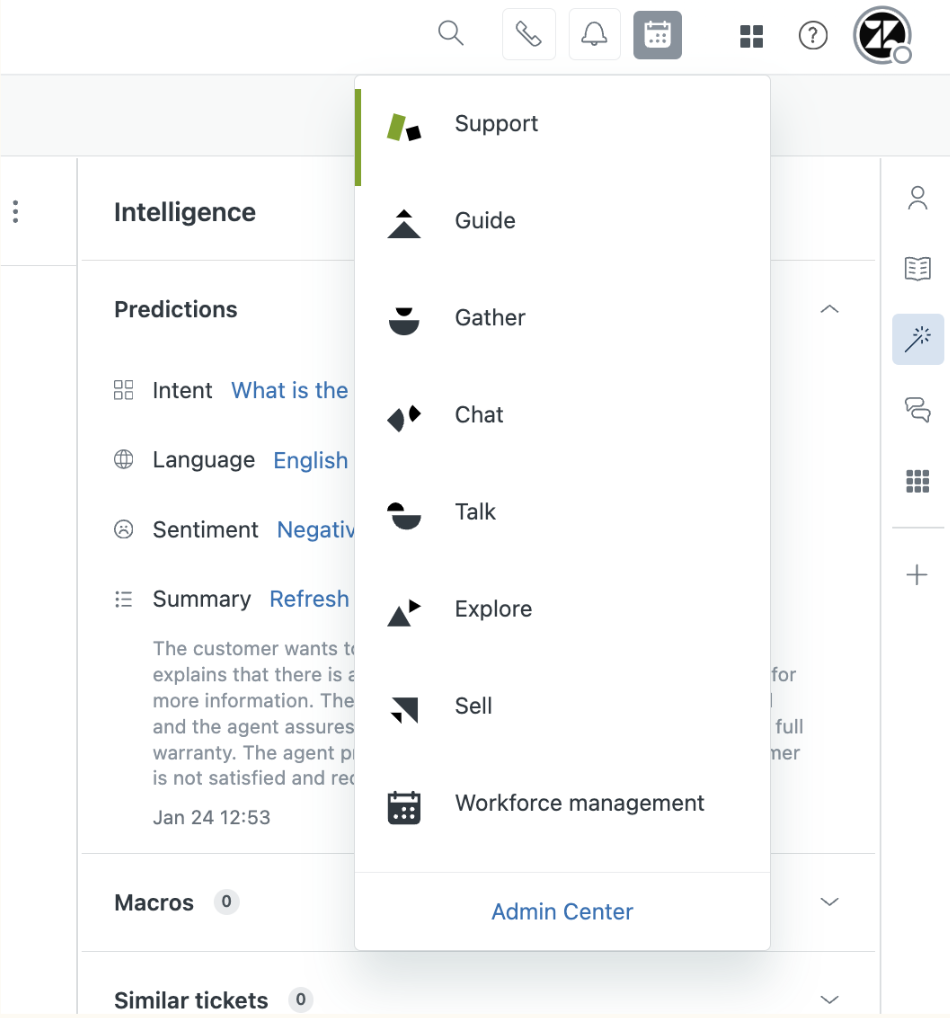
The tray still included legacy iconography (relationshapes) and branded product names (e.g. Explore, Guide, etc.) that had since been deprecated
The addition of new acquisitions had the tray offering a mix of branded names + relationshapes with localized capability names + icons. This approach caused confusion and distrust as some of the feedback we’ve received internally is that the new additions look like they’re bugs and are not functioning properly.
Scalability problems
Updating the product tray globally required an exorbitant amount of resources to build and test each unique instance. This will prove difficult as Zendesk had announced they were intending to acquire several new capabilities (and quickly).
When new acquisitions were added to the tray, we used capability names instead of creating new branded product names. These names are localized and do not scale well in the current design of the tray.
The idea
Let’s use this as a forcing function to:
finally update the outdated branded items in our product tray (something we’d been pushing for for 3 years)
create a shared global component for all engineering teams to consume to easily update the tray over time

Strategy
Once I found an engineering team to help and got leadership approval for further exploration, I put together requirements and guiding principles for the design solution. While the designer in me wanted to swing for the fences on this opportunity for a whole new design, I knew we needed to take a more pragmatic approach given the desired timing and amount of stakeholders.
The primary goal is wayfinding: As we come up with new terminology and iconography for the product tray, our main goal will be helping users know where they need to go to accomplish what they’re trying to do. We’re going for clear over clever. Familiar over unique. We’re not looking to create relationshapes or branded names 2.0.
Reflects the existing design language: While we know we need a more modern visual language that better reflects the latest Zendesk rebrand, that work needs to happen separately. We’ve tried to move toward the new Zendesk iconography styling and color and explorations have proven challenging to have small glimpses of the new brand try to exist within a product so deeply rooted in a differing visual language. So for this first implementation of creating the product tray as a global component, we’ll stick to the existing style and visual language for a more consistent UX and look and feel.
Outcome
The final solution uses the design system, offering gains in both accessibility and experience consistency. Terminology was aligned on by design, PM, PMM, documentation, and localization and verified for comprehension in using testing. Change like this is always hard for long-time and power users, but the feedback we received was very positive.
Lean into Zendesk being the only brand: While we won’t be adopting the new visual language, we are going to lean into the brand philosophy that Zendesk is the one and only brand. One product (with several capabilities) with one brand. That means no more relationshapes and no more branded product areas.
Accommodates longer capability names and globalization: The current product tray has single word branded product names that aren’t translated into other languages. The new product tray needs to be designed with globalization in mind at the forefront, not an afterthought. To provide the clarity we’re striving for to help people find their way, capability names will likely consist of multiple words and will be translated in full to provide that clarity to folks in every language.
Designed to scale: The new product tray must be designed in a way where adding new capabilities is easy.